
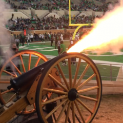
Even Our Strength Program Knows A Good Logo When They See It
-
Who's Online 23 Members, 1 Anonymous, 259 Guests (See full list)
-
Images

-
Tell a friend
-
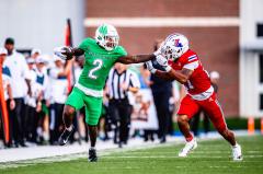
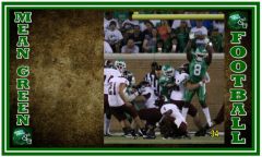
What's going on Mean Green?
-
33
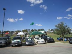
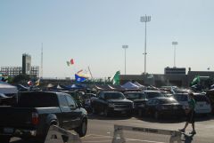
Improving the Student Game Day Experience
I agree with this statement. On this board, we keep harping on the students. The students showed up and showed out against SFA and they are not a name brand. We need to start harping on why we can't get the 300,000+ alumni in DFW to the games. I bet the student section will be full today and our alumni will stay home and be T-shirt fans of other schools. -
1
Other Games 9-21-2024
That’s rough, man. Glad the American has the Houston market. 😬😬😬- 1
-

-
36
Morris needs to own the Caponi hire
Let's be more specific than "done the job before at D1 level". A guy that has done it before at a Power school, but never seen the struggles at Group level, would concern me. I don't think it's a deal breaker, but my preference would be someone that is getting it done at our level or lower, and is hungry to prove himself. Older guys that have proven themselves at Power level also might not be that hungry anymore. -
59
What some are predicting for the Wyoming game
Would you bet all your a Star Wars figures? INCLUDING Boba Fett? -
59
What some are predicting for the Wyoming game
It won’t be a blowout…this I can confidently guarantee- 1
-

-
-
Popular Contributors
-
1

-
2

-
3

-
4
-
5
.jpg.2c34139d28f511fc91b929fa21c6b081.thumb.jpg.34e326535d3dc1a502adf551cec2bd5a.jpg)
-
-
Member Statistics
-


Recommended Posts
Join the conversation
You can post now and register later. If you have an account, sign in now to post with your account.
Note: Your post will require moderator approval before it will be visible.