
.jpg.852c6f841b532c29f1fb58fe0fd284a6.jpg)
.jpg.b35861a4cf12e13ce0f214f58b8d2d31.jpg)
-
Tell a friend
-
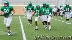
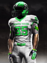
What's going on Mean Green?
-
33
Kendrick Saved The Super Bowl
I mean, of course you're going to find people enjoying Billy Joel at a Billy Joel concert. Kendrick is an artist that appeals to the masses, just not everyone. Same as in my example I pointed out that I wouldn't care about a Billie Eilish halftime, even though she's absolutely gargantuan at this moment. -
2
I-35 On Ramp at North Texas Blvd Permanently Closed
Cue the latest excuse for poor attendance. "I cOuLdN't FiNd ThE eXiT tO tHe StAdIuM."- 1
-

-
33
Kendrick Saved The Super Bowl
I think it IS possible to find a performer that will at least appeal to the masses. I just don't think the NFL cares. I'd love to see Billy Joel perform. I went to one of his concerts last year, and I saw all age groups and races enjoying his show. -
2
Softball: #11 Texas Tech (2/18/2025)
Smart move. It's gonna be miserably cold......for those games in Arlington. Since it's a Th-Sat tournament......wonder if they might move it all back one day??- 1
-

-
9
Wow Memphis lost to Shockers
Fun history with Temple: They won the first NIT championship, which was founded in 1938 and is one year older than the NCAA. It wasn't until the 1950s that the NCAA overtook the NIT as the premier tournament/national championship. WIKI says, Temple is 1 of 4 programs to appear over thirty times in the NCAA and never reach the Final. 6th all-time winningest D1 program, over 2000 wins.- 4
-
-
-
Popular Contributors
-
1

-
2

-
3
-
4
-
5

-
-
Member Statistics
-
Most Points
-
1

-
2

-
3

-
4
-
5

-
-
Biggest Gamblers
-
1

-
2
-
3

-
4

-
5

-
6

-
7

-
8
-
9

-
10

-


Recommended Posts
Join the conversation
You can post now and register later. If you have an account, sign in now to post with your account.
Note: Your post will require moderator approval before it will be visible.