


-
Tell a friend
-
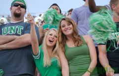
What's going on Mean Green?
-
16
-
0
TURNOUT OF HONOR TEAMS
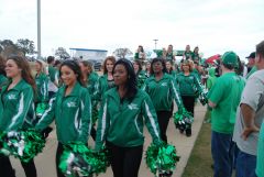
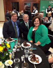
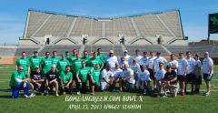
I wasn't able to make it to the game but wondered what the turnout was like for the members of the football teams being honored. I saw the video of Johnny Quinn so I assume he was there. How many others? We need to do all we can to encourage support from former players. Where there special activities planned for this group? -
64
What some are predicting for the Wyoming game
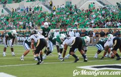
I was 1000% wrong on the score and I am ecstatic about that. I came close to what we would score, but I was dead a$$ wrong about what our D would allow. That 3-4 we ran was much better than that 3-3-5 crap and it showed on the scoreboard. -
-
27
Wyoming Game Critical
Revisiting these points after win over Wyoming, increasing our record to 3-1. Let's keep the momentum going with a win against Tulsa...our first conference game! The AD needs to keep up the emphasis on attendance with another round of unique ideas. GMG!
-
-
Popular Contributors
-
1

-
2

-
3
.jpg.2c34139d28f511fc91b929fa21c6b081.thumb.jpg.34e326535d3dc1a502adf551cec2bd5a.jpg)
-
4

-
5
-
-
Member Statistics
-


Recommended Posts
Join the conversation
You can post now and register later. If you have an account, sign in now to post with your account.
Note: Your post will require moderator approval before it will be visible.