Jump to content

Recommended Posts

Posted

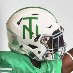
Did someone mention in the "traditions" topic that SOW combined with NT might be an option? I kinda like using the two tones of green for the "Mean Green", but the black makes more of an impact against the white.

SOWwithNTonWhite.jpg

SOWwithNTBlackMaskcopy.jpg

Posted (edited)

When most Texans who are legitimate NCAA D1-A college football fans see a helmet with a Mustang or Pony on it and in the colors of red and blue, most of them know that that is SMU's helmet--no one in the Southwest has anything close to it (except a few Texas HS's who copied it starting with the Grapevine HS Mustangs)...........

................same with the UT Longhorn's helmet and some might ask the question of why this with SMU and UT? Could one answer be that those 2 schools established their helmet logo traditions decades ago and just merely stuck with it (no matter who their latest college president or AD's on their respecitive payrolls would be)? One of the best parts of logos that are set in stone and tradition might be by anyone just visiting the SMU and/or UT message boards just to see how many threads they've had (ever) with the subject or theme: "What do we need to do with our alma mater's football helmet design for this upcoming football season?" How about........................Z-I-L-C-H ! ! !:)

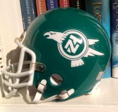
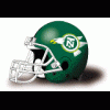
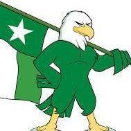
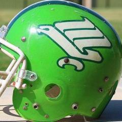
SON OF WORM LOOKING GOOD, GB1 ! I personally like that green eagle, ie, son of worm that GB1 has posted on his thread, but what if we used his idea, left this NT helmet in tact and as is for about 10 years running, then would there be a need for an"N T" or letter combination on this helmet at all beginning with the first year it would be used?

Sorry, I'm just a fan of the mascot logo on a helmet with no school name or school letters on then whatsoever, just like the Texas Longhorns, SMU Mustangs etc, etc, etc, I realize that if we had such a helmet half the threads we've seen the last few years on GMG.com would not have ever appeared or been posted!

A problem we still seem to have at UNT is just getting a large majority of our best fans/alums on the same page and just sticking with something for an extended period of time as to even give a new helmet ample time to grow in popularity with most of our alums and fans. I recall that Hayden Fry's flying worm was not all that popular with many until we started beating (or playing very close) some pretty big time D1 football schools. Then Rick Spear's flying worm logo helmet became a symbol of some semblance of success no other Mean Green football teams in our history had experienced. BUT.............................Jeez, how many helmet design changes have we had since the Corky Nelson era? :blink:

Again, it looks good to me, GB1, but with the variation of having nothing else on your helmet such as in the form of names or letters except for the eagle. And wouldn't such a helmet settle (once and for all) all the North Texas font ideas and the "N T" letter combo/ideas we've seen by our graphic artists or the hundreds of fonts one could use to spell out the words "North Texas" on our football team's helmet.

CHANGING UNT HELMET LOGOS/DESIGNS QUITE FREQUENTLY IS (sadly enough) A NORTH TEXAS TRADITION. :huh:

Edited by PlummMeanGreen
Posted

That helmet looks 100% better than what we have now. I met SMUG out at practice today and thought the whole time "is that helmet design the best we can come up with?"

any comments on practice?

Posted

Is there a reason that none of these helmet designs have the entire SoW logo? It's either the front half (here) or just the wings and tail (Smitty). Yes, it'll be small, but we're not going to have half a logo on our helmet.

Posted

Is there a reason that none of these helmet designs have the entire SoW logo? It's either the front half (here) or just the wings and tail (Smitty). Yes, it'll be small, but we're not going to have half a logo on our helmet.

What does SOW stand for?

Posted

The "Son of Worm," as I understand it. The current eagle, which some feel bears a striking resemblance to the "flying worm" of the Hayden Fry era.

It does. Look at the wings and talon specifically. On the front wing, it's 3 stripes and curves up at the end, and the talon is the same crescent shape.

Posted

The flying worm is my avatar. I changed the original lime green, though, to a darker green.

GMG!

Posted

Best logo and helmets we ever had. We should go back to it!

I never understood this. I am not going to argue about it, just contribute my own perceptions.

1) The attachment only makes sense to me if you like to be unique. That thing is surely unique. But don't kid yourself, it looks nothing like an eagle...

2)...it looks like a smelly turd playing a balancing act on a log. And I'm not trying to be funny. That's my first thought after seeing it.

Ok, so it looks like a "Flying Worm". or "Son of Flying Worm". That's cool. I can see that, too. But now why do so many Mean Green Eagles fans want a logo that looks like a super-hero earthworm? Is this what we had during the winning Fry era? Is this really the logo you want the mass media to identify with after we grow into a 1A football power?

Posted

Ok, so it looks like a "Flying Worm". or "Son of Flying Worm". That's cool. I can see that, too. But now why do so many Mean Green Eagles fans want a logo that looks like a super-hero earthworm? Is this what we had during the winning Fry era? Is this really the logo you want the mass media to identify with after we grow into a 1A football power?

It's called a stylized Eagle (not that I'm any art expert) but it is as much an Eagle as the K-State Wildcat logo is that. It's like Mean Green, it is Unique. The best thing about it is the simplistic design (like the longhorn), and by it's slanting forward design it invokes a forward-motion look on a helmet.

Posted (edited)

It's called a stylized Eagle (not that I'm any art expert) but it is as much an Eagle as the K-State Wildcat logo is that.

As much as the K-State Wildcat logo is a cat? Horrible comparison. At least when I look at the KState logo, I'm thinking cat. Take it to any 20-somethin year old sitting in a coffee shop that knows nothing about NCAA athletics and they'll see the cat. Show them that SOW and I'm not really sure what they'd guess.

We're totally together on everything else you just mentioned: something stylized, "leaning" forward, and simplistic sounds very cool.

I can actually imagine myself getting attached to this because it is so unique, and I think someone has mentioned in the past that GGII designed it years ago, or at least had a part in it. On second thought, I'm just not sure what I think about it. Do I think it's unique and would I support it if implemented? Yes, but I'd hope it wouldn't be in jest or have some underlying humor about it. Additionally, kudos for it being as revered as it has become. But I still stand by my perception that it is - at best - a remote representation of an Eagle.

PS: This is probably just The Dude in me speaking, but am I the only one that thinks the head of the SOW is too vaginal? Anyone?

Lebowski-11.JPG

Edited by greenminer
Posted

Is there a reason that none of these helmet designs have the entire SoW logo? It's either the front half (here) or just the wings and tail (Smitty). Yes, it'll be small, but we're not going to have half a logo on our helmet.

Unfortunately it doesn't fit.

Posted

w03fb3.gif

This is the gayest design I have ever seen. What the heck is it. You think people want to wear shirts and hats with this thing on them? You think people want to support a university with the rediculous looking pile of worm crap? You think our players want to be seen in something like this? This logo is the dorkiest, most nerdy, stupidest logo ever. It looks like some hippy on Fry st designed it when they were stoned. If we want to be taken seriously as a D1 University, this crap has to go. It's almost as rediculous as that stupid albino squirrel. Why dont we make a stupid flying albino squirrel with crooked wings and call him SOS?

Posted

This is the gayest design I have ever seen. What the heck is it. You think people want to wear shirts and hats with this thing on them? You think people want to support a university with the rediculous looking pile of worm crap? You think our players want to be seen in something like this? This logo is the dorkiest, most nerdy, stupidest logo ever. It looks like some hippy on Fry st designed it when they were stoned. If we want to be taken seriously as a D1 University, this crap has to go. It's almost as rediculous as that stupid albino squirrel. Why dont we make a stupid flying albino squirrel with crooked wings and call him SOS?

FYI...This is by far the most popular logo North Texas has ever used and was instantly recognizable which is the purpose of a logo, isn't it? Sorry you don't like it, but many would still prefer this being used.

Posted

but many would still prefer this being used.

Many of whom? You and a few other ppl on this board and possibly the older alumni. Why dont you go around and ask the greek system, the athletes, and students and see what they have to say.

Either way, it isn't coming back and I dont think that being 'instantly recognizable' is a good thing if it's for a bad reason.

Posted

Many of whom? You and a few other ppl on this board and possibly the older alumni. Why dont you go around and ask the greek system, the athletes, and students and see what they have to say.

Either way, it isn't coming back and I dont think that being 'instantly recognizable' is a good thing if it's for a bad reason.

You are missing the point anyway. The Fry era stylized eagle, aka Flying Worm, was never coming back anyway. The new eagle logo, Son of Worm as some call it, is what we are referring to.

Posted

You are missing the point anyway. The Fry era stylized eagle, aka Flying Worm, was never coming back anyway. The new eagle logo, Son of Worm as some call it, is what we are referring to.

Thanks for clarifying. I was confused which was which. It makes sense now.

Join the conversation

You can post now and register later. If you have an account, sign in now to post with your account.
Note: Your post will require moderator approval before it will be visible.

Guest
Reply to this topic...

×   Pasted as rich text.   Paste as plain text instead

  Only 75 emoji are allowed.

×   Your link has been automatically embedded.   Display as a link instead

×   Your previous content has been restored.   Clear editor

×   You cannot paste images directly. Upload or insert images from URL.

  • Tell a friend

    Love GoMeanGreen.com? Tell a friend!
  • What's going on Mean Green?

    1. 11

      #Hit6!

    2. 7

      Fire Everybody

    3. 15

      Earth to GMG

    4. 3

      AAC Trend - Year 2 of 5 Firings

    5. 41

      I hope we lose to Temple

  • Popular Contributors

  • Member Statistics

    • Total Members
      15,479
    • Most Online
      1,865

    Newest Member
    meangreen0015
    Joined
  • Most Points

    1. 1
    2. 2
      NT80
      NT80
      129,958
    3. 3
      KingDL1
      KingDL1
      128,415
    4. 4
      greenminer
      greenminer
      118,610
    5. 5
      TheReal_jayD
      TheReal_jayD
      104,984
  • Biggest Gamblers

    1. 1
      EdtheEagle
      EdtheEagle
      26,589,381
    2. 2
      UNTLifer
      UNTLifer
      4,156,819
    3. 3
      untphd
      untphd
      779,513
    4. 4
      flyonthewall
      flyonthewall
      670,422
    5. 5
      3_n_out
      3_n_out
      578,480
    6. 6
    7. 7
    8. 8
    9. 9
    10. 10
      outoftown
      outoftown
      314,541
×
×
  • Create New...

Important Information

We have placed cookies on your device to help make this website better. You can adjust your cookie settings, otherwise we'll assume you're okay to continue. Please review our full Privacy Policy before using our site.