Jump to content

Recommended Posts

Posted

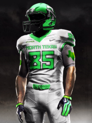
I am disappointed BECAUSE for the entire spring and summer we have been told about this new fangled uniform that everybody was going to love. Many of you have stated that you can't wait to see them. Then they trot out the same tired design, except for a change of font?????? That is why there is a debate.

Some of you, I am sure, that if they came out in all white with dog crap smeared on them that you would think that it was a good look. Think about the best uniforms in C.Football today and then compare with ours.

Oh ya, and Fouts is a GREAT stadium too. wink.gif

Posted

I am disappointed BECAUSE for the entire spring and summer we have been told about this new fangled uniform that everybody was going to love. Many of you have stated that you can't wait to see them. Then they trot out the same tired design, except for a change of font?????? That is why there is a debate.

Some of you, I am sure, that if they came out in all white with dog crap smeared on them that you would think that it was a good look. Think about the best uniforms in C.Football today and then compare with ours.

Oh ya, and Fouts is a GREAT stadium too.  wink.gif

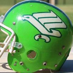
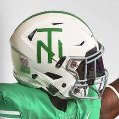
The new helmets look absolutely terrible. They look terrible in the paper as well as on TV. This is the result of a politician trying to play Athletic Director.

Posted

The new helmets look absolutely terrible.  They look terrible in the paper as well as on TV.  This is the result of a politician trying to play Athletic Director.

They don't look terrible. They look ok, not ideal, but nowhere near terrible. I'm afraid this is an overreaction.

Posted (edited)

I agree... the helmets are the worst in 1A. I was not a big fan of the script, but its a lot better than the crap we have on our helmet now.

I like the North Texas font... just not on a helmet.

Last yr our uniforms/helmet were perfect. We shouldn't have changed them.

Edited by ipEAGLE
Posted (edited)

I agree... the helmets are the worst in 1A.  I was not a big fan of the script, but its a lot better than the crap we have on our helmet now.

I like the North Texas font... just not on a helmet

That is what I was trying to say - that the font looks terrible on the helmets. I don't mind it in the end zone or on paper - but it does NOT look good on a helmet. I can't think of a helmet that looks worse in college football.

Edited by stebo
Posted

We have known for a long time that there would be no new uniforms this year. Several months. I don't know why everyone acts so surprised. It will be okay, I don’t think anyone is not going to come to a game or watch a game because they “just can’t stand to look at that uniform.” If that is the case, then we don’t need them as a fan. I guess in the future the university should okay everything they do with Tony. He obviously has the only opinion that counts and everything he doesn’t like is dog poo. huh.gif

Posted

I actually like this design. Yes, we could have done better...but I think this one will grow on me faster than the script did. I remember (very well) the looks on all of our faces when the team ran out of that tunnel with the script on their hats. We had no warning at all, and you could hear the crowd in section E yelling " What the HELL?" I was sick? This design didnt do anything like that to me... that has to be a good sign. Like it or not, this is what RV is going with, which makes it a mute point in my book. We back RV, so we back this helmet. (I know, there was an outside influence here, but we do what we have to do to support Rick)

We'll get used to it, guys... hang in there.

GMG!!!

Posted

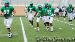
Honestly guys/gals, they really aren't THAT different. The average joe schmo college football fan isn't even going to notice that we've changed anything. The color is the same, and the rest of the uni looks almost identical (outside of the gigantic numbers).

My wife actually commented that the new helmets were easier to read on TV than the older script ones. Much as I hate change, I have to agree with her.

Now....what to expect next year when we supposedly conform to the new shade of green???......

Posted

My wife actually commented that the new helmets were easier to read on TV than the older script ones.  Much as I hate change, I have to agree with her.

My wife said the same thing. RV wants the average college football fan to flip on the tv and be able to know that North Texas is playing as soon as they see the helmet. The helmets could have pictures of Robert Blake paying a hitman to shoot his wife on them for all I care, as long as we are winning ballgames.

Posted (edited)

The numbers on the jerseys are way too big and make our players look like midgets.   blink.gif

Large numbers so that NT fans can see the numbers while sitting in far away seats at Fouts. ph34r.gif

For the record, I do not like the new helmet logo. Rather have the script North Texas if we can't have an interlocked NT in some form.

Edited by DeepGreen
Posted

Man, I really disagree... In fact, I really like the font the numbers are in, and I must say, I like the embroidered numbers when compared to the iron on look seen on most unis, including in the pros (See Dallas Cowboys). I like the new font, and it's VERY easy to see the North Texas on the helmet.

Other than NORTH TEXAS in the prescribed font, what else would you have rather seen? The new eagle logo would have been OK, but since the Football Team is the "MEAN GREEN" I'd say that would just add to the confusion.

Posted

In my opinion these uniforms below are the best uniforms and we should have stuck with them (just not the star logo on the outside shoulder):

user posted image

To me the BIG NAME accross the chest is to High School ish to me, there are very few big name programs that still have there name plasterd accross the chest.

Posted

You know what I think?

It really doesn't matter what I think. And for that matter, it really doesn't matter what any of us think about the unis this year. The program isn't going to shell out money for new unis, and we've already had the discussion that these are just for this year.

All this jawing on about a uniform that won't be here next year anyway is really a lot of wasted energy. Rather than moaning about unis, how about we focus on what matters- and that's the Tulsa game!

Posted

I understand that... but why have NORTH TEXAS plastered on the helmet?

Second option: no text on jersey and have eagle logo on helmet.

I dont mind the North Texas on the helmet for a couple of more years, if we jumped out there this year and put the new ealge on the helmet then nobody outside GMG.com would have any idea who was playing in the game when there flipping through the channels. Now once that new ealge logo becomes more of a household image in a couple of years then i would like to see the change made but untill then lets keep it simple and go with what has worked the last few years and stay with North Texas on the Helmet.

Now on to what type of font. I loved the script, but we no longer use that anywhere, not on the (field, stadium, media guide, fan guide), no where. So if were not going to use the script anymore then we have to take it off the helmet as well. Since what they put on the helmet is the new font that is being used everywhere (the end zones, the media guide, the fan guide, the pictures on the website, etc...) then its the one that needs to be on the helmet for now.

Posted

Not much we as fans can do right now about the Tulsa game other than bring as many people to the game as possible. For now, I just jump in on the threads at GOMEANGREEN.COM and give my opinion.

Posted

How will the eagle logo get any recognition/household appeal if we never use it?

From what im hearing there is a greater then ZERO chance that it will be painted at Midfield, if this is the case, and being that it was used on the telecast last week, we have ESPN 2 coming in here this year, and the more publictiy we raise by winning football games will make it a household image.

Posted

The new helmets look absolutely terrible.  They look terrible in the paper as well as on TV.  This is the result of a politician trying to play Athletic Director.

I know everyone is going to hate me for this, but I'd like to see the new full sized eagle on a helmet. The only thing THAT would look is a big interlocking NT but obviously thats never going to happen. The 'son of the worm' would be second best.

Posted

Don't know if this is a poll or not but I:

Like the helmet (scripting) better than last year.

I also like the "Mean Green" on the chest.

Don't like the large numbers.

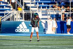
Have never liked black socks.

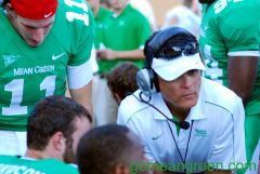
I think the coaches could use better uniforms.

I also like not seeing a water boy for the head coach?

Join the conversation

You can post now and register later. If you have an account, sign in now to post with your account.
Note: Your post will require moderator approval before it will be visible.

Guest
Reply to this topic...

×   Pasted as rich text.   Paste as plain text instead

  Only 75 emoji are allowed.

×   Your link has been automatically embedded.   Display as a link instead

×   Your previous content has been restored.   Clear editor

×   You cannot paste images directly. Upload or insert images from URL.

×
×
  • Create New...

Important Information

We have placed cookies on your device to help make this website better. You can adjust your cookie settings, otherwise we'll assume you're okay to continue. Please review our full Privacy Policy before using our site.