Jump to content

Recommended Posts

Posted (edited)

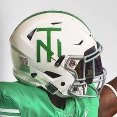
The new "UNT" font is starting to grow on me. It has graduated from - "atrocious" to "doesn't suck"

Also, the current circle star - for reference - is still in the "atrocious" category. So doesn't suck is an improvement. laugh.gif

Also - don't take this to mean that I'd want this on any helmet or uniform...

Please resume the normal meaningless posts of football offseason. New UNT

Edited by Stan R
Posted (edited)

The new "UNT" font is starting to grow on me.  It has graduated from - "atrocious" to "doesn't suck"

Also, the current circle star - for reference - is still in the "atrocious" category.  So doesn't suck is an improvement.  laugh.gif

Also - don't take this to mean that I'd want this on any helmet or uniform...

Please resume the normal meaningless posts of football offseason. New UNT

As some of you know, I am in the post-secondary education business and I hear "UNT" roll off many tongues (old and young) with absolutely no giggles, ha-ha's or whatever some of the rest of you seem to be getting in your work environments.

Highway signage will always display "UNT" when they don't won't to spell out our full name, such as UNT Health Science Center at Fort Worth which thousands see every day on FW's Interstate 30 West.

I guess one might say we are who we are because we sure can't undo the fact that we are U of NT.

Edited by PlummMeanGreen
Posted

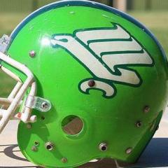
I'll always like the helmet logo from my avatar; the Erric Pegram years.  Everything else can go hang.

I liked the interlocked "NT" on the logo but wasn't crazy about the "eagle thru the hula hoop".

Posted

"eagle thru the hula hoop".

Worst logo ever. I'll even take "UNT" over that thing. Hope they put the new eagle (not the head one) on the helmet along with "North Texas".

Posted

I am also starting to like the look of it as well... its very simple, but at the same time it has a very bold appearence.

I agree, i think all of it is really starting to grow on me. I'm a student and i'm pretty pleased with it.

Posted

I liked the interlocked "NT" on the logo but wasn't crazy about the "eagle thru the hula hoop".

I have a class ring with the interlocked "NT" on the crown of the ring. It's is just like the late 80's "NT"

Join the conversation

You can post now and register later. If you have an account, sign in now to post with your account.
Note: Your post will require moderator approval before it will be visible.

Guest
Reply to this topic...

×   Pasted as rich text.   Paste as plain text instead

  Only 75 emoji are allowed.

×   Your link has been automatically embedded.   Display as a link instead

×   Your previous content has been restored.   Clear editor

×   You cannot paste images directly. Upload or insert images from URL.

×
×
  • Create New...

Important Information

We have placed cookies on your device to help make this website better. You can adjust your cookie settings, otherwise we'll assume you're okay to continue. Please review our full Privacy Policy before using our site.