

-
Who's Online 0 Members, 0 Anonymous, 217 Guests (See full list)
- There are no registered users currently online
-
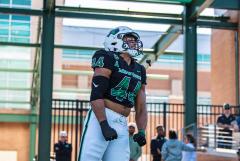
Images

-
Tell a friend
-
What's going on Mean Green?
-
12
Why are we doing this?
Just wanted to stop in and say, the egg should be white with a green eagle. 😁 -
3
2025 Softball: Around the AAC Mega Thread
No further help Saturday as the top three teams in the conference all collect sweeps. The winner of this weekend's final home series against South Florida will be in at least second place with a double bye going into the last weeked of the regular season. Upcoming Series South Florida @ North Texas Tulsa @ UTSA Memphis @ FAU Charlotte @ Wichita State East Carolina @ UAB Conference Tournament if it started today Wednesday, May 7 | First and Second Round Game 1: No. 9 UTSA vs No. 8 Tulsa | 10 a.m. | ESPN+ Game 2: No. 10 Memphis vs No. 7 UAB | 1 p.m. | ESPN+ Game 3: Game 1 winner vs No. 6 East Carolina | 4 p.m. | ESPN+ Game 4: Game 2 winner vs No. 5 Wichita State | 7 p.m. | ESPN+ Thursday, May 8 | Quarterfinals Game 5: East Carolina/UTSA or Tulsa vs No. 4 Charlotte | 12 p.m. | ESPN+ Game 6: Wichita State/Memphis or UAB vs No. 3 North Texas | 2:30 p.m. | ESPN+ Friday, May 9 | Semifinals Game 7: Game 5 winner vs No. 1 FAU | 1 p.m. | ESPNU Game 8: Game 6 winner vs No. 2 South Florida | 3:30 p.m. | ESPN+ Saturday, May 10 | Championship Game 9: Game 7 winner vs Game 8 winner | 12:00 p.m. | ESPN2 -
15
1977 interview with Bill Blakeley
Man, that was a really cool video to watch. Thanks for posting it on here! -
28
I seem to recall…
I respect y'all sentiments about the unfairness of the system, but clearly none of you are really aware of the money involved. SMU has some crazy billionaires. But those couple big spenders are necessary because they have few alumni. With proper organization and motivation, UNT COULD definitely be in the #25-#50 spend range no question. Totally doable. Not top 10.... but guess what: those teams already had a huge payroll. NIL just makes it above the table and more democratic. UNT's athletic department and university administration is not totally bought in. I wouldn't give them NIL money either. They aren't in it to win. But if they change their mind, you'll find more NIL available. The donors at SMU are spending because the school is now in it to win. If we had the university governance we did in 2005, they wouldn't be spending, I assure you.- 1
-

-
30
WBB: Transfer Portal
I am hearing through some sources that the team was not really together. I will leave it at that.- 3
-

-

-

-
-
Popular Contributors
-
1

-
2

-
3
-
4
-
5
.jpg.2c34139d28f511fc91b929fa21c6b081.thumb.jpg.34e326535d3dc1a502adf551cec2bd5a.jpg)
-
-
Member Statistics
-
Most Points
-
1

-
2
-
3

-
4
-
5
-
-
Biggest Gamblers
-
1

-
2
-
3

-
4

-
5

-
6

-
7

-
8
-
9

-
10

-


Recommended Posts
Join the conversation
You can post now and register later. If you have an account, sign in now to post with your account.
Note: Your post will require moderator approval before it will be visible.