Jump to content

Recommended Posts

Posted

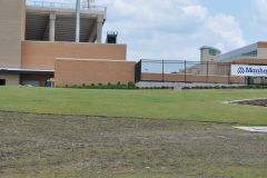
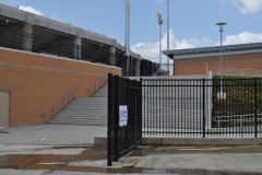
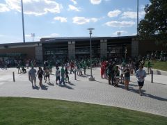
I know a good chunk will go towards the lighting which is a good thing but what about the rest?  I personally would like to see them paint the ugly brown green -- it would give the exterior more color and spirit.  I also would like to see them tear down that crappy circa 1970 sign and put something bigger and brighter in its place.  Make it big and proud.  The technology is a lot cheaper than it used to be we ought to be able to make that sign pretty nice.  Other thoughts?

Posted

Let's invest in the fans and hire more Benfords - to the point where one Benford can be assigned to every poster who doesn't understand basketball at the college level. These Benfords can take them through workouts, drills, etc. until everything they are seeing finally makes sense. Once a fan does get it, they can keep their Benford with a minimum MGC donation and 5 year commitment, or trade him in for an old box of Tony Mitchell t-shirts that just arrived last month so another fan can have him.

  • Upvote 6
  • Downvote 4
Posted

Build in actual ticket booths, remove the green media desk section and replace with actual seats, fire benford. 


How about big SOW banners over the bricks?

Posted

The lighting is priority #1, then getting rid of the press row that is waaayyyy to big, and then the signage outside needs major improvement.

But I'd have rather them spent $650k and bought out Benford after last season and used $4.8 million for renovations now.

  • Upvote 3
  • Downvote 1
Posted (edited)

Come on guys, can we give the fire Benford a rest already?  We know where everyone stands on that. 

He's still here, right? It's going to nearly impossible to have any discussion of the Men's program or North Texas basketball in general without that four suited albatross being central to the conversation.

No idea what 5.5m buys, and I know there are certain limitations since the AD doesn't own it, but I would:

  • Add ticket booths
  • Redo the lighting
  • Build in a team store
  • Convert almost all of the 'press area' back to seating
  • Update the bathrooms with automatic equipment
  • Find a new food vendor, because good God
  • Produce some full size banners to drape down the outside of the building with either players or logos
  • Get some gameday organizers who know how to make the environment not the most bland place on Earth

Other than the media row thing (not saying it's wrong I just don't care about it as much) I can't really add anything to that list. A nice team store would make a huge difference in look and feel of the building. That might be my favorite part of your list assuming it's done right.

Edited by Army of Dad
  • Upvote 2
Posted

No idea what 5.5m buys, and I know there are certain limitations since the AD doesn't own it, but I would:

  • Add ticket booths
  • Redo the lighting
  • Build in a team store
  • Convert almost all of the 'press area' back to seating
  • Update the bathrooms with automatic equipment
  • Find a new food vendor, because good God
  • Produce some full size banners to drape down the outside of the building with either players or logos
  • Get some gameday organizers who know how to make the environment not the most bland place on Earth

Spend some of it to officially change Tony Benford's name to Tony Denton, that man could coach.

  • Upvote 6
Posted

Build in actual ticket booths, remove the green media desk section and replace with actual seats, fire benford. 


I believe ticket booths are in the plans.

  • Upvote 5
  • Downvote 1
Posted

you can always move the team benches further into the corner like every NBA stadium.  Most of those players watch the games without a chair. 

Or... why not build a stage behind the scorers table.  it works just fine for a couple rows of premium seats on the opposite side of the stadium.  if space is still that much of an issue, they might be able to get rid of the first row of seats behind the scorer's/media section to allow a few more feet.

  • Upvote 1
Posted

And so where is all this open space on the floor you guys wanna move the media to?


Most places would put it on the floor where the floor seats for $1,000 mean green club donors now sit.  I don't think that particular group would give up their real estate very easily, but the press section is a ridiculous amount of prime location in the arena.  If there isn't a way to outright demolish it, at least drastically reduce it in size.  I mean, in reality, who's there on a given night besides Vito?  Do we really need the several hundred spaces?

As for the pit overall, I think it stacks up nicely against other college basketball arenas I've been too.  It's perhaps a bit large for the fan base that UNT attracts, but I can live with that.  However, everything about it makes me feel like my mother taking me to the Ice Folley's in the 70s.  The outer architecture, the weird paneling on the upper interior walls, the unadorned concrete of the concourse, the dim lighting.  It's like stepping back in time, but without the mustache and form fitting flared pants.

For only 5.5 million, I don't know where I'd start.  Maybe I'd start in attempting to get uniformity for seat size and leg room.  Buy a ticket at the door for a game, and you may end up in business class or back of the plane Spirit Airlines.  It's a total crapshoot.

  • Upvote 1
Posted

1. Lighting, follow a bunch of college teams and light the floor and a bit into the stands heavily, almost like the spotlight. 

2. Massive bright fun video boards and stat boards. 

3. TV/VIDEO boards at each exit (like smut) 

4. Skinny video board that goes around the entire arena where you put some sort of go mean green, etc slogans that look clean. 

5. Get some dang ticket booths installed on 2 sides, just like at apogee. I'm tired of standing in the cold to buy a ticket. 

6. Am I out of money yet? Let's update the bathrooms and flooring/lighting around the ring we walk to get to games, it's very dull. 

7. I'm terrible at budgeting, but as silly as this sounds you have to eww and aww recruits if flashing lights and video boards do it, so be it. 


so essentially lets just build a new stadium. I'm in. 

  • Upvote 1
  • Downvote 3
Posted

so essentially lets just build a new stadium. I'm in. 

5.5 million to renovate is not quite near enough to build a new "stadium" they typically call those things arenas in basketball. 

Posted

5.5 million to renovate is not quite near enough to build a new "stadium" they typically call those things arenas in basketball. 

I am saying is it worth into spend and out so much into an out dated building. Why not save it and in the next 5 years look to build a new one. 

  • Upvote 1
  • Downvote 2
Posted

They spent 47 million and all but rebuilt moody. Adding suites and all sorts of cool stuff. http://www.dallasnews.com/sports/college-sports/smu-mustangs/20130226-nichols-after-57-years-of-memories-smu-s-moody-coliseum-ready-for-47-million-face-lift.ece


5.5 million we will probably ask MGC members to volunteer to help paint to save money.

  • Upvote 2
  • Downvote 1
Posted

Most places would put it on the floor where the floor seats for $1,000 mean green club donors now sit.  I don't think that particular group would give up their real estate very easily, but the press section is a ridiculous amount of prime location in the arena.  If there isn't a way to outright demolish it, at least drastically reduce it in size.  I mean, in reality, who's there on a given night besides Vito?  Do we really need the several hundred spaces?

As for the pit overall, I think it stacks up nicely against other college basketball arenas I've been too.  It's perhaps a bit large for the fan base that UNT attracts, but I can live with that.  However, everything about it makes me feel like my mother taking me to the Ice Folley's in the 70s.  The outer architecture, the weird paneling on the upper interior walls, the unadorned concrete of the concourse, the dim lighting.  It's like stepping back in time, but without the mustache and form fitting flared pants.

For only 5.5 million, I don't know where I'd start.  Maybe I'd start in attempting to get uniformity for seat size and leg room.  Buy a ticket at the door for a game, and you may end up in business class or back of the plane Spirit Airlines.  It's a total crapshoot.

the $1000+ donors who choose to sit there that is. I personally think floor seats suck.  Bad view in my opinion, but they have them because some folks like them...not because I don't. 

What about creating media space "up top"?  Where the film folks can be as well....up near the rafters.  Why not?  Is there some rule that they have to take up space where paying customers could be sitting?  If we had enough paying customers that is....one day perhaps.  So, prepare now, yes?

  • Upvote 1
  • Downvote 1
Posted

the $1000+ donors who choose to sit there that is. I personally think floor seats suck.  Bad view in my opinion, but they have them because some folks like them...not because I don't. 

What about creating media space "up top"?  Where the film folks can be as well....up near the rafters.  Why not?  Is there some rule that they have to take up space where paying customers could be sitting?  If we had enough paying customers that is....one day perhaps.  So, prepare now, yes?

I did notice that when we had all those scouts coming in for Tony Mitchell that they tended to sit up high.  I wondered up there once, and honestly, I had trouble discerning which player was which and I still have 20/20 vision (knock on wood on that one), so I'd think media would probably rightfully need to be closer to the action than that.  I don't have the solution, but I stand firm on the fact that all that media section would be waaaay better served as a revenue stream for paying fans.

  • Upvote 2
Posted

the $1000+ donors who choose to sit there that is. I personally think floor seats suck.  Bad view in my opinion, but they have them because some folks like them...not because I don't. 

What about creating media space "up top"?  Where the film folks can be as well....up near the rafters.  Why not?  Is there some rule that they have to take up space where paying customers could be sitting?  If we had enough paying customers that is....one day perhaps.  So, prepare now, yes?

I think court side seats are awesome even though I do not have them. I have been down there before and it's cool to get to converse with players and feel like your right on the court. 

  • Upvote 1
  • Downvote 2

Join the conversation

You can post now and register later. If you have an account, sign in now to post with your account.
Note: Your post will require moderator approval before it will be visible.

Guest
Reply to this topic...

×   Pasted as rich text.   Paste as plain text instead

  Only 75 emoji are allowed.

×   Your link has been automatically embedded.   Display as a link instead

×   Your previous content has been restored.   Clear editor

×   You cannot paste images directly. Upload or insert images from URL.


  • Tell a friend

    Love GoMeanGreen.com? Tell a friend!
  • What's going on Mean Green?

    1. 8

      Ladies at ACU

    2. 8

      Next week's ECU game is our last chance this season to sellout DATCU Stadium

    3. 8

      Team transportation to San Antonio

    4. 67

      Caponi fired

  • Popular Contributors

    1. 1
    2. 2
      NT80
      NT80
      126
    3. 3
    4. 4
      keith
      keith
      101
    5. 5
      SUMG
      SUMG
      97
  • Member Statistics

    • Total Members
      15,478
    • Most Online
      1,865

    Newest Member
    meangreen0015
    Joined
×
×
  • Create New...

Important Information

We have placed cookies on your device to help make this website better. You can adjust your cookie settings, otherwise we'll assume you're okay to continue. Please review our full Privacy Policy before using our site.