-
Posts
453 -
Joined
-
Last visited
-
Points
110 [ Donate ]
Content Type
Profiles
Forums
Gallery
GoMeanGreen.com
Everything posted by 3XL
-
agree...8 would be ideal...but at least now D1 football has a plus-one playoff-championship...much better than the past
-
I think Ohio State gets in....big convincing win in a championship game against a ranked opponent... plus...it would put the "TCU or Baylor" debate to bed. The B12 screwed TCU & Baylor by not having a championship or tie braker game. I didn't like it when the PAC10 & BIG10 didn't have to play one and now B12. If you're in a big bad Power 5 conference...then you should have to...the other 4 are. we'll see...I am pulling for TCU. "One True Champion" *or 2 that's "one" funny slogan now....everyone gets a blue ribbon
-
this...
-
-
From the album: college uni
-
my top 4-6 1. ULL 2. Texas State 3. New Mexico State 4. Arkansas Sate not on list 5. (Navy) 6. (Army)
-
"craphole"...the place 90 likes to mix his game drinks. Criticizing other schools & their football program makes you/us sound like fools. In the late 80's...North Texas great...QB Scott Davis called out Kansas State which...at the time...had the longest losing streak in the nation. Well...check the records of where KSU went after 1989 vs where NT went. 90...mix your drink & enjoy the game.
-
From the album: college uni
Gadorade Man says...remember kids...stay in school and never put horn stripes on a uniform. -
-
From the album: college uni
-
https://games.yahoo.com/blogs/ncaaf-dr-saturday/texas-a-m-unveils-throwback-1939-uniforms-for-saturday-s-game-against-ulm-142038288.html;_ylt=AwrTHRkJ9VJUsHQAfxrBGOd_;_ylu=X3oDMTE0NDNyMWp0BHNlYwNzcgRwb3MDMgRjb2xvA2dxMQR2dGlkA1VJMDFUQzFfMQ-- not a fan of maroon or A&M...but I thought these were pretty cool throwbacks...well done...they committed to one year...they even replicated a 1939 stiched up leather-head helmet...
-
take it easy my fellow green brother....I come in peace. We're having a debate about "our school" and "sports" which we both want to be better...that's it. I apologize about upsetting you. At some point...it would be nice to split a tailgate mean green peace beer or coke with you & UNTFan23. I would really prefer to be friendly with most everyone on this forum. (Queen90 will be with the team for pregame...so we'll leave her out) To answer your thoughts above....I don't feel that my designs were ignored...I think they inspired our black "alternates" and may inspire other decision makers later on...really...just throwing ideas on the table and Scrappy...I love Scrappy! skid row Scrappy...buff Scrappy...we all love Scrappy...I just don't see Jerry & Steven putting Rowdy on the Cowboy's helmet anytime soon. don't over design things if something simple works better...schools have multiple logos to use as needed..."Texas doesn't put their Longhorn on their baseball helmets & caps". we need an additional NT mark for some of the sports merchandise...to break it up a bit..it is about economics & perception....because we're selling a product
- 126 replies
-
- 3
-

-
- Brett Vito
- Mean Green Football
- (and 2 more)
-
agree...the longhorn, razorback and mustang are all terrific marks...but our eagle looks unbalanced & mechanical....plus we want to go by the MEAN GREEN. ...North Texas is better suited for the interlocked letters...ie North Carolina's NC, Notre Dame's ND or Texas Tech's double T
- 126 replies
-
- 5
-

-
- Brett Vito
- Mean Green Football
- (and 2 more)
-
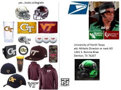
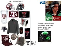
I didn't design the letterman's logo...it's just an appropriate look for any university with an athletic program...that's it. I never said kill the bird...I just think...NT & Mean Green are better and that we seriously need to add an "additional logo" for sports...it's about perception & economics. You have to look like a big boy university to be one... I don't know why you're defending a lesser logo for our school...maybe you work for the post office, were on the design committee that approved it or received a degree from the University of Phoenix...whatever... jus saying...we could do better.
- 126 replies
-
- 5
-

-

-
- Brett Vito
- Mean Green Football
- (and 2 more)
-
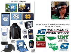
big meh from most kinda says a lot...unfortunately...we missed the mark with the bird/word logo... we were denied our chance to be "Texas State " however many years ago...so the N & T makes more sense, has more history, ties the old with the new and looks more collegiant. We're lucky that NT is symmetrical, unique and looks great. Too bad we chose to look more postal and on-line college...huge opportunity for the next batch of decision makers or AD. for now we'll just have to settle for being the "meh green"
- 126 replies
-
- 6
-

-

-
- Brett Vito
- Mean Green Football
- (and 2 more)
-
outstanding work Christopher....agreed...that "Good Will Hunting" short was awesome! thank you for sharing....
- 22 replies
-
- 1
-

-
- UNT Football
- Mean Green Memes
-
(and 1 more)
Tagged with:
-
-
From the album: college uni
-
...agree we'll never be 1) a trendy Oregon or 2) a traditional Texas so...what these concepts are supposed convey is a traditional "updated" look...that tastefully combines old school & new school... IMO "we're doing it wrong"....we could save money and still get 2 or 3 different looks with 2 plain pants (1) white (1) black 3 jerseys (1) green (1) white (1) black 1 helmet (1) a traditional looking helmet with the NT letterman's logo that ties the old with the new...this logo would stay on the helmet and not change year to year or month to month. (ala Texas A&M or Texas Tech)
-
I guess...for one..."you"? you cared enough to change your avatar to "our" latest helmet...from this week.
-
totally agree...we can do better.
-
East Carolina not only hangs with top a 25 Virginia Tech...but upsets them. damn...watching that game made me happy & sad.
-
Queen90 really needs new hobbies besides...homophobia, shitter stall mixology and being a puffed up X & O guy. I'm thinking he may like Bingo, Square Dancing & Cross Words...
-
more liked miffed on why Queen90 reads & comments on every uni post... I have been reading Queen90's "big man" post for over two years and I keep asking myself "what went wrong with this dude...was he picked on as a kid...is he a frustrated old dumb jock...did his family not love him enough?" yes...like it or not...uniforms matter...they're part of the equation. I'm sure that Queen90 and most all other old dudes would at least agree that the Marines have some of the best uniforms in our military. That's not a fluke...it's by design....that uniform helps in the recruiting young people...it gives those young men & women pride when they wear it...and tells the rest of us...they're no joke...the U.S. Marines are for real.

