-
Posts
453 -
Joined
-
Last visited
-
Points
110 [ Donate ]
Content Type
Profiles
Forums
Gallery
GoMeanGreen.com
Everything posted by 3XL
-
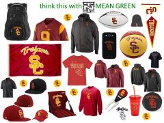
USC is also similar to UNT in name. USC primarily uses three distinct logos in their sports merchandising. Trojan Head USC interlocked SC wow...another university using multiple logos with zero "brand confusion". USC has a very balanced approach, marketing all three logos about the same...a third, a third and a third. UNTFan23- Honest Question: Are they California Southern CS or Southern California SC? just joking...really...I come in peace and know that you do too! I know you are a great guy and support our University better than I do. You have passion for our school & probably even go to some basketball games...ha. I have passion too...only...I get hung up in football uniforms and merchandising. I think we both just want our school to be better...let's say from really good to great! ok...back to merchandising and more money! it's time to turn another corner and "expand the brand!" Good Design is Good Business! go mean green 3XL
-
-
From the album: college uni
-
An additional mark for athletic gear would be nice....we're leaving money on the table. Our letterman's NT is balanced, unique & collegiate. It ties the old with the new. It's never too late to add a traditional college mark, that can stand the test of time. 100 years from now, I would bet that the OU, BU, NC & ND's of the college football world will still be using their interlocked marks. shades of green come & go "green, apple green, dark green, darker forest green, mint green, kelly green" logos come & go "NT, flying worms, parakeets, daffys, hand drawn eagle, clip-art eagle, sow" mascots come & go " see...the evolution of Scrappy" fonts evolve and change with the current design trends ...bring back the NT for our second 100 years!
-
-
From the album: college uni
-
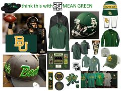
I kinda already qualified why I used North Carolina & Notre Dame as examples to follow...but will list again for UNTFan23. - both "Top 10" for collegiate merchandising - both similar in name to University of North Texas Why not? Why not look to the biggest, the best & the brightest for inspiration? Why reinvent the wheel? Let's talk OU....may not have a wagon everywhere....but tons of shirts will simply say "Sooners" or "Oklahoma". Seems like every North Texas hat, shirt, key chain or car emblem has our "mechanical diving eagle". If it only said "Mean Green" or "North Texas" sometimes...that would be refreshing. ok then...let's talk Baylor...small private...12K undergrads...not in the top 75. They have done a terrific job branding. May last year, at Rally House, I was blown away by the assoment of cool Baylor gear. Kept thinking to myself "freaking Baylor has way more meaner & greener gear than our Mean Green". Please note that I did not have any "brand confusion" when I saw a "bear head" or "a bear paw" or "Baylor" or "Sic'em" or "BU". To be bigger...we need to think bigger...brand bigger! (expand the brand) I don't see a down side to adding a traditional collegiate mark to expand our brand and gain additional revenue.
-
not really...in college football If you see a clover leaf or a fighting leprechaun or a ND does it cause brand confusion? If you see a tar-heeled foot or a NC does it cause brand confusion? If you see a covered wagon or OU does it cause brand confusion? To me it would not be total chaos or confusing at all...just an additional mark & more money for our school.
-
not really...we are all under the green umbrella....we are "North Texas" people
-
ding ding ding....thank you captain obvious Let's see how can I explain it any clearer or in terms that you will understand. (ie) let's say that UNT's current Brand Idenity Sheet is "Windows 8"....it's time to update, improve, modify & download....to "Windows 9"...still similar to "Windows 8" but different & little better... Mean Green 93-98 said it best...please see his post
-
....most large universities have a variety of logos. The variety allows for the appropriate brand for a specific use. (i.e.) The newest Oklahoma State University brand identity sheet has over 6 unique logos to use were they see fit. *as far as internet sites still using outdated logos....sounds like they need a new Nick Burns.
-
DT90 is correct...#1 Texas & #12 "12th Man-Land"
-
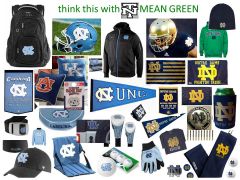
What items would you like to sell? What items would you need for growth? Do you want North Texas Athletics to be bigger and sell more merchandise? Yes...winning helps, but North Texas Athletics could brand & market itself a little better by adding "one" additional logo. Perception is reality. If it looks better...it will sell better. This is about "sports pride" and better tailgate gear...flags, car emblems & clothing. Attached is an example of "How-To-Do-It 101". The attachment has random merchandise & logo use by two of the best in the business. That's right...I said "business". I hope that North Texas is not allergic to money. I primarily featured both North Carolina & Notre Dame because: 1) They are both in the "Top 10" for collegiate merchandising. 2) Both are "similar in name" to North Texas. replace words "Fightin' Irish", "Irish" or "Tar Heels" with "Mean Green" replace image of "leprechaun", "clover", "foot" or "ram" with our eagle replace logo of "ND" or "NC" with our letterman's "NT" Out of the top 75 schools in merchandise sales, (Notre Dame ranks #3) & (North Carolina ranks #9). I think we could learn something about marketing from these two schools. Yes, they are both P5, but look at the way they use their NC & ND logos in merchandising. Out of the top 75 universities listed, over 90% use some form of a 1-2 letter initial or lettered logo in their brand management. Maybe you don't want a baseball cap with a diving eagle on it or a "green light to greatness" koozie. North Texas did not crack the top 75...but look who did. #54 East Carolina, #63 South Florida, #66 Memphis, #68 Texas State, #70 Louisiana Lafayette, #71 Colorado State & #72 Marshall. The big-dog top 25 universities get it. They understand the power of simple & sound collegiate design. What are we missing? What do they know that we don't? What are they doing that we're not? Marketing to your target audience, branding your institution, recruiting young people & new fans are all part of the equation. NT has been branding better the last few years, but it's time to turn another corner. Bottom line...big picture...it's about more money & respect for our university. Good Design is Good Business. 3XL
-
From the album: college uni
-
Off Season Discussion: Greatest Memory of the 2013-14 Season?
3XL replied to UNTLifer's topic in Mean Green Football
1) that 4th quarter at the HOD was incredible new years day...watching our team win...at the historic Cotton Bowl...was so much fun! 2) the "Stand" against a salty Rice team -
sports cry.... thank you for the post RETSO....I spent a little time searching the web...the week after the national championship game...looking for a North Texas ranking. I didn't find anything beyond the top 25....but #33...how cool is that!?! go Mean Green...
-

Pedestrian Bridge - PAINT THE RUST GREEN!
3XL replied to greenblooded_gal's topic in Mean Green Football
no...not homeless...but there are rumors that he is using... -

Pedestrian Bridge - PAINT THE RUST GREEN!
3XL replied to greenblooded_gal's topic in Mean Green Football
really?!? ...this is a terrific looking bridge. It is well designed and very low maintenance. Question: Should we paint all the cement on Apogee "green" just because we can see it from the highway? Answer: no (a little ambient green lighting on bridge...maybe...but paint no) besides...we have bigger issues...Scrappy really needs our help...he's in a dark period. -
agreed...he's not cuddly or cool like most mascots...he is pretty creepy. put me down for $40 on the scrappy re-hab fund...
-
There are some great post here...I really enjoyed Plum & UNTFan23's duel....both good...both funny...I + arrowed both guys! It's pretty exciting that we can envision, a little more clearly, what this place could be like in 10-20 years. I agree with HoustonEagle....open spaces can really kill the football environment...let's max what we have first....

